Who is the client?
Refuel Creative is us. And it may seem weird to create a case study on our own website, but after eight years of helping businesses accelerate their growth, we decided it was time for more than just a fresh coat of paint for ourselves. We launched a reimagined website that is all about our users (including you).
We wanted to tackle this website from a design-thinking perspective and come up with a design that was:
- More customer-centric
- Easier to do business with us
- A good experience on both mobile and desktop
What was the problem?
It seemed to us that we were getting a decent amount of traffic to the website, but we weren’t getting a lot of people getting in touch wanting to know more about us. We simply weren’t converting website visitors, but we needed evidence to prove this. So we set out on a journey to find out what was happening and where the opportunities for improvement were.
Traffic without conversion
Our analytics painted a concerning picture: despite homepage views jumping from 3,201 to 12,375 after our 2022 rebranding, visitors weren't converting into leads or customers. Most spent less than a minute on our site—significantly below the industry average of 7.4 minutes—with the homepage showing bounce rates climbing to 69% in 2023 (reaching 77% on the B variant). This brief engagement suggested we were successfully attracting visitors but failing to give them compelling reasons to stay, explore our services, or take action.
Navigation frustrations
Heat maps and interviews with some of our stakeholders revealed users struggled to navigate our site effectively, with visitors clicking on non-interactive headings and graphical elements throughout the site. We could see people also having difficulties finding specific service pages. One client we interviewed said it was "slightly hard to navigate, no ability to search, and doesn't give motivation to users to explore the website," while another pointed out poor "discoverability" and lack of clear pathways from the homepage to our service offerings.
Poor content organisation and lack of customer focus
While our brand was visually bold and attractive, we consistently heard that our layout and messaging needed improvement. We received comments like, "everything is there, but it needs to create a more logical journey for users," and that service page information was "all over the place and doesn't draw the eye in," lacking a story or logical flow. Internal feedback further revealed that "pages don't have a clear goal – just information dumping" and our messaging "doesn't talk about [users] or how we can solve their problems”. It seems we were focusing on explaining our services rather than addressing customer pain points and solutions.
Service visibility issues
Despite investing considerable resources into creating comprehensive service pages, clients and leads frequently expressed surprise about those said services. We saw comments like "I didn't know you did that." For us, this highlighted a critical failure in communicating our capabilities. This was also a problem reflected in our analytics, where service page performance varied dramatically. Stakeholders wanted to see "simple and clear explanation that says what a company does" with "clear statements of capabilities," and suggested that "if we want to aim to have an integrated services package, then the website should convey that message" instead of letting customers "cherry-pick services." We had the proof now. Our website wasn't effectively showcasing our full range of services or how they work together.
Our needs
- More user-friendly navigation and overall user experience
- Have our abundant content tell more of a story and be customer-centric
- Highlight our services in a strong and clear manner
- Showcase what HubSpot can do with more interactive elements
- Highlight HubSpot’s Knowledge Base
What we did
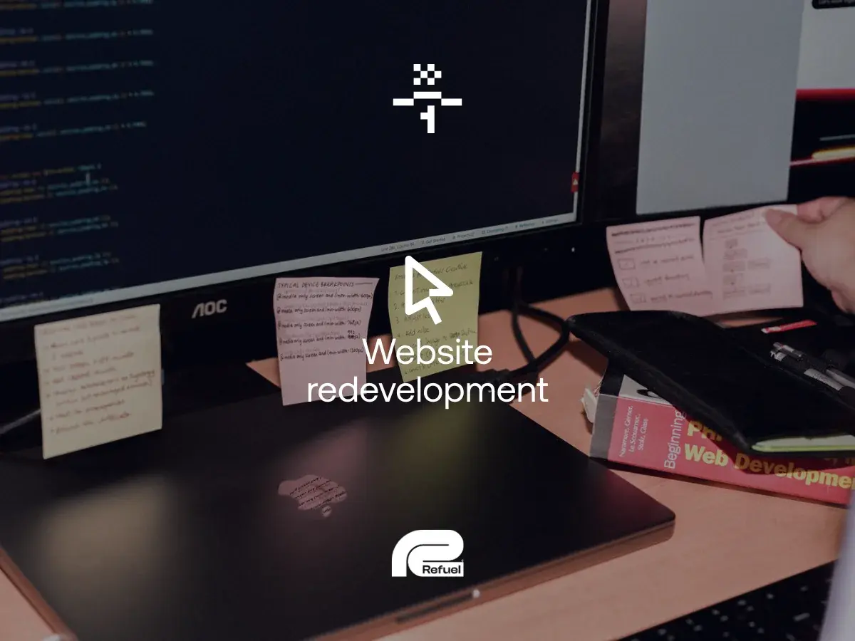
Web design and development
With our goals clearly defined, we moved on to creating designs for the website. One of the things we wanted to focus on was creating visual consistency across our pages. Considerable effort went into developing a comprehensive design system that defined everything from buttons and forms to spacing and typography.
We committed to a number of design decisions to provide a customer-centric user experience. We added more engaging photos of people to add a human touch to our site. Our brand colours were expanded with tints and shades to improve accessibility. We used colour more intentionally to enhance the storytelling aspect of our content. We also introduced a card-style layout system to increase readability and, especially, highlight things such as our services and team members.
We wanted a positive user experience, not just for readers, but for the team members using it. So while we were developing this website as a fully custom theme in HubSpot, we put a lot of effort into creating modules and templates that were easy to customise and didn’t impact the visual consistency of the website.
SEO
Our research revealed that despite increased traffic after our previous rebranding, visitors weren't finding all our service offerings. To address this, we restructured our content architecture to improve discoverability and implemented clearer pathways between related services. We carefully analysed the performance of individual service pages and used these insights to optimise our navigation and internal linking strategy.
The new site structure better highlights our full range of capabilities, ensuring potential clients can easily find exactly what they're looking for. By implementing a more logical user journey and improving page layouts, we've created an SEO foundation that not only helps search engines understand our service offerings but also guides users naturally through our content.
Digital strategy
From the inception of this project to the post-deployment marketing, we were guided by a strategy that was based on our own winning formula. This wasn’t just a new website. We had thought and purpose behind everything we did. We researched, spoke to people, looked at the stats and made smart and data-driven decisions before a mock-up was even created. As you will see, the strategy included some key components: social media, email marketing and SEO.
Content marketing
Almost every image and every word of the website is ours. Every team member in some way had a role to play in seeing this reimagined website come to life. We rewrote our content to focus on customer challenges rather than just explaining our services, addressing the feedback that our messaging wasn't customer-centric enough.
Our new approach emphasises storytelling and creates a more logical journey for users. Key information like case studies and snapshot statistics are now highlighted for time-pressed visitors. We've improved how we present our integrated service offerings, showing how they work together to provide comprehensive marketing solutions rather than appearing as disconnected options to "cherry-pick" from. The result is content that not only clearly communicates our capabilities but also demonstrates our expertise through its structure and presentation.
We also created numerous blog articles and (this) case study to showcase the intention and effort that the team invested in this project.
Social media marketing
Redesigning and redeveloping a website is a big endeavour, and so we needed to have a proper marketing campaign to go with it. In the lead-up to the hard launch of the website, we hid some Easter eggs in our social posts and built anticipation with sneak peeks about an “exciting project”.
We created a sense of mystery with numerous posts teasing that "something exciting is coming to Refuel," while playfully mentioning we'd been keeping a secret. During this pre-launch phase, we subtly integrated our expanded colour palette into all graphics, which was a key element of the upcoming website redesign. We also updated our social media icons to reflect these new brand colours, giving observant followers early hints about the changes ahead.
Behind-the-scenes content was a big part of our strategy too. We shared candid photos of our team during photoshoots around the office, which were actually in preparation for the new website images. This gave our audience glimpses into the process while maintaining the element of surprise.
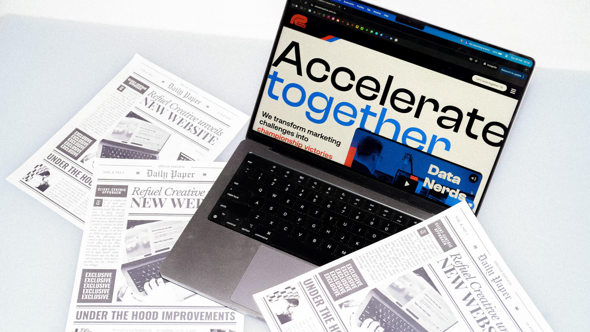
For the actual launch, we put together a creative reveal video featuring a printed newspaper announcing the big news and a bow being untied on a laptop screen to unveil the updated website. To celebrate internally, we hosted a website launch party and later shared these celebration photos with our audience, bringing them into our moment of pride.
Following the launch, we posted a carousel of photos we took around the workplace with messaging that emphasised our commitment to showcasing our actual team, workspace, and equipment on the new site instead of generic stock photos. We highlighted that visitors would see they're collaborating with real people in a real space—not strangers in perfectly staged office scenes—reinforcing that authenticity isn't just something we talk about, but something we live.
Email marketing
We also focused our marketing for the website into our email communications to let everyone who loves Refuel know what had been going on. We sent a specific email out to our database with the big reveal. We shared all the new features and wrote the email in much the same way we wrote the website copy, with you in mind. We shared what the new website meant for our customers instead of what we wanted it to do for us.

The challenges
During development, we had various members in the team help with building pages in HubSpot. With varying levels of HubSpot (and design) experiences across the team, the challenge here was maintaining visual consistency across pages. To tackle this, our web developers made sure to create templates and modules which contained the design styles in the backend, while allowing minor customisation options to the user. As well as this, we made sure to thoroughly review each page for consistency once it was built out.
We had made a decision to include more images of people, more specifically the people in our team. When looking at previous photos, there wasn't quite enough to fill out the website. So we saw this as an opportunity to develop and establish a new photography style for us.
While we were full-steam ahead for this website, we had to make sure that we continued to provide our clients with the quality they deserved. We tightened up our project management processes, and set clear deadlines. We ensured that communications were regular, open, and transparent, so that we could keep track of progress, issues, and potential blockers.
The results
The website has been improved by prominently featuring our team members and showcasing our capabilities more effectively and thoughtfully. We've restructured all information around customer needs, making the site significantly easier to read and navigate for users. Every element now has intentionality and purpose—from our expanded colour palette that guides users through different sections to the strategic placement of calls-to-action that enhance the user journey.
Our social media website launch campaign delivered impressive results across all platforms, with a 416.7% increase in organic social traffic to our website, complemented by a 47.8% increase in social media interactions, and a 200% increase in link clicks.
Conclusion
The best part about this whole project for you is that we played the guinea pig. We tested everything on ourselves first. We know 100%, you are receiving the best service, we are taking the best approach when it comes to your business and we are using the best tools.
We’re continuing to grow our own website, with plans for more pages and resources to help you grow your business. We pride ourselves on the expertise we have and we hope that you can take the time to explore what Refuel can do for you.