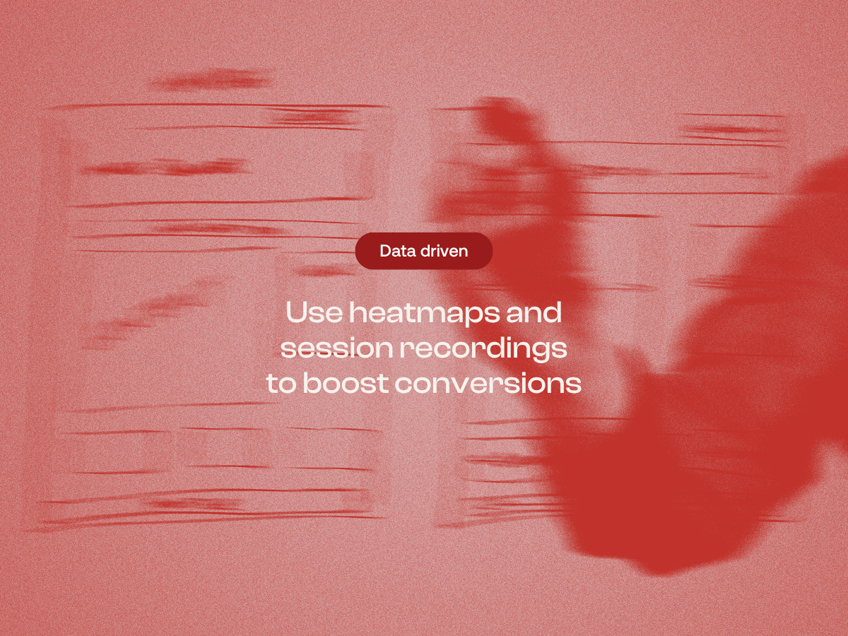
Using heatmaps and user data to improve your website
Last updated: 15 April 2026
We have all sat in that meeting. You are reviewing the new website design and someone says, "I feel like that button should be blue." Maybe it is the CEO, or maybe it is the loudest voice in the room.
They have a hunch that blue will pop more. They might even cite a competitor's website as proof.
But here is the reality of modern web design. Feelings are not facts.
Your CEO might want a blue button. But data often shows nobody scrolls far enough to see it. But you don't have to guess what your users want. We watch what they actually do.
By using data driven decision making, we move the conversation from subjective opinions to objective improvements. It is no longer about who has the best taste. It is about who has the best evidence. Here is how we use tools like heatmaps and session recordings to turn user behaviour into better conversion rates.
Opinion vs data
The biggest enemy of a high performing website is the assumption. It is easy to assume users know to click an image. Or that they will read three paragraphs of text on your home page. You might assume that because you built the user journey a certain way, people will follow it.
Unfortunately, real human behaviour rarely follows the happy path we design in wireframes.
When we rely on UX data analysis, we often find that user behaviour contradicts our internal logic. You might think your navigation menu is intuitive. Data often reveals users frantically clicking headers that do not work. This gap between what we think is happening and what is actually happening is where you lose money.
This is why we lean heavily on analytics tools. They provide the evidence needed to make confident decisions about changes. Instead of asking "what looks best?", we ask "what works best?"
Why Google Analytics isn't enough
Most marketing managers are comfortable with Google Analytics. It is an essential tool for understanding traffic sources, demographics and general flow. However, Google Analytics has a blind spot. It is excellent at telling you what happened, but it struggles to tell you why it happened.
For example, you might see a high bounce rate on a specific landing page. Google Analytics tells you that 70% of people leave without interacting.
But why? Is the content boring? Is the page loading slowly? Is the call to action broken? Did they not find what they were looking for?
This is where visual data comes in. To truly understand user behavior, you need to see the experience through their eyes. You need to go beyond the numbers and look at the qualitative interactions. This is the realm of heat mapping and session replays.
The tool breakdown
To get this granular level of insight, we use a suite of tracking tools. We typically utilise platforms like Hotjar or Microsoft Clarity depending on the client's specific tech stack and privacy requirements. While they function similarly, they offer different lenses on your user data.
Here is exactly what we look for when we audit a site.
Heatmaps
Website heatmaps are visual representations of where users click, move and hover on your site. They take thousands of data points and aggregate them into a colour-coded overlay. 'Hot' areas (usually red or orange) show high engagement. 'Cold' areas (blue) highlight parts of the page users ignore.
There are different types of heatmaps that tell different stories.
Click maps show where users are tapping or clicking. This is vital for checking if your primary links are working.
One of the most common issues we find is dead clicks or rage clicks. This happens when a user clicks an element that looks like a button, such as a bold heading, but nothing happens. If you see a cluster of angry red clicks on a static image, you have found a major source of user frustration.
Move maps track mouse movements. While eye-tracking software is expensive and requires lab conditions, mouse tracking is a fantastic proxy. Research suggests there is a strong correlation between where people look and where they move their cursor. By analysing these trails, we can see if users are reading your headlines or skipping straight to the pricing table.
Scrollmaps
These show us exactly how far down the page people are scrolling. This is often the most sobering report for a marketing team to review. It is common to see that only 25% of users make it to the bottom of a page.
We often see designs that hide critical information, like the Buy Now button, in the footer. If scrollmaps show a sharp drop-off at the fold, you know why conversion rates suffer.
This data helps us define the false bottom. This occurs when a design element, like a large hero image or a horizontal line, tricks the user into thinking the page ends there.
If scroll data drops from 100% to 10% at a specific line, you need to encourage scrolling. You might add a visual cue like an arrow or cut an element in half to suggest more content exists below.
Session recordings
If heatmaps are the aggregate data, session recordings are the individual stories. This is where we watch real, anonymous users navigate the site. It is essentially a DVR of the user experience.
We can see exactly where they hesitate, where they get confused and where they encounter friction. Watching a recording of a user failing to complete a checkout form offers more value than thousands of spreadsheet rows.
You might see a user fill out a form, get an error, try to fix it, fail again and abandon the site. That is a lost sale that Google Analytics would just record as a bounce. But with recordings, you can see that the Phone Number field was rejecting their format. That is an easy fix that directly impacts your bottom line.
A real world example
Let's look at how this applies to improving conversion rates in practice.
We recently reviewed a client's landing page that had high traffic but low conversions. The team's initial instinct was to change the headline or add more persuasive copy. They felt the messaging wasn't landing.
However, after reviewing the UX data, we noticed a different pattern entirely.
First, the scrollmaps showed that users were scrolling down to the enquiry form. This validated that the copy was actually doing its job. People were interested enough to scroll.
Second, the session recordings revealed the actual bottleneck. Users would start filling out the form, but 50% of them abandoned the process halfway through. They weren't leaving because they weren't interested. They were leaving because the form was annoying.
The recordings showed users pausing at a specific field asking for a Company Website URL. Many didn't have one, or didn't want to share it yet, so they left.
We removed that single field and made the phone number field optional. The result? Conversions doubled almost overnight. No copy changes, no redesigns, just removing a barrier that the data revealed.
This is the power of user research. We stopped guessing and started solving the actual problem.
Hotjar vs Microsoft Clarity
Clients often ask us which tool is better. The answer depends on your needs.
Hotjar is the industry veteran. It offers a robust suite of tools including feedback polls and surveys that pop up on the screen.
If you want to ask users direct questions like "What is stopping you from buying today?", Hotjar is a great choice. It is excellent for capturing the voice of the customer alongside the visual data.
Microsoft Clarity is a newer player, but it is completely free and incredibly powerful. It integrates seamlessly with Google Analytics. Clarity has some unique features, such as an automated dashboard that highlights rage clicks and dead clicks without you having to hunt for them. For many businesses, Clarity provides the necessary heatmaps and session data to make informed decisions without a monthly fee.
Both tools will allow you to segment data by device. This is crucial because user engagement on mobile is often radically different from desktop. A menu that works perfectly with a mouse might be unusable with a thumb. Analysing these segments separately ensures you are improving user experience for everyone, not just desktop users.
Translating data into design
Collecting data is only the first step. The real value comes from interpretation. This is where we look for patterns that inform our design sprints.
High engagement on a blog post but low engagement on a product page suggests we should test a product highlight on the blog.
If users scroll rapidly past a large text section, we know to break it up with bullet points or images.
When users click a non-clickable icon, we should make it clickable or remove the hover effect.
This process allows us to focus our roadmap. Instead of redesigning the entire website every two years, we can make continuous, incremental improvements every month. This approach, often called Growth Driven Design, is less risky and more cost-effective.
Improving user experience to drive revenue
Ultimately, analysing mouse movements and monitoring the user journey does more than improve usability. It makes the site sell better.
Every friction point you remove is a potential increase in revenue. Every time you clarify a confusing layout, you keep a potential customer in the funnel.
Improving conversions is rarely about one magic button colour. It is about stacking up small wins.
It is about fixing the broken link on the mobile menu. It is about simplifying the checkout process. It is about moving the customer review up to where people actually look.
When you focus on improving user experience based on facts, the financial metrics tend to look after themselves.
How to start
The most critical step in this process is installing tracking scripts before you plan a redesign or launch a campaign.
Whether you are using HubSpot to track contact timelines, or Microsoft Clarity for interface data, you need a baseline. If you don't know how your current site is performing, you won't know if your changes are actually an improvement.
Many businesses make the mistake of installing these tools only after they launch a new site. They miss the opportunity to compare the before and after.
We recommend running these tools for at least two to four weeks. This gathers a reliable amount of user data. You need enough sessions to filter out anomalies. Once you have that baseline, you can start forming hypotheses and running tests.
By installing these tools now, you build a library of data. This ensures facts, not just feelings, support your next website update.
Partner with us for growth driven design
Gone are the days of building a website, launching it, and leaving it untouched for three years. These days, the world moves too fast for the set and forget approach.
If you are tired of guessing what your users want, it is time to look at the data. We specialise in Growth Driven Design. This method uses ongoing research to improve your site every month.
Do you need a full website review? Or a partner to manage your monthly updates? We are here to help. Let's install the right tools, gather the evidence, and turn your website into a high-performing asset.
Contact us to discuss auditing your user experience.


.webp)