
09 October 2020

These days there are a multitude of different ways for someone to access your website.
Are they using a desktop? If so, what screen resolution do they have? Is it Windows, Mac or something else? What browser are they using?
Even on mobile devices you can ask all these questions again.
Long story short, with so many different ways to view a website, it’s important you test your site across as many different technologies as possible.
Let’s get started, and try to nail down exactly how you can go about doing this.
User Acceptance Testing (UAT)

Also sometimes called UAT testing (by the same people who call it a PIN number presumably) is the final stage of the testing process, and defined by Technopedia as:
“the last phase of the software testing process that verifies whether a product or software is fit for the purpose it was built for in the first place”
How do we use UAT in this specific case? The single most accurate and reliable way to test your website on multiple platforms and browsers is to literally access an actual version of the devices and browsers to see how your website performs.
Now, chances are you don’t have a room full of different laptops, desktops and mobile devices for the purposes of testing (though if you do, that’s awesome). So if you don’t have access to a device, how do you test your site on it? That’s where UAT comes in. You open the site to your clients, who likely are running different hardware and software, and ask them to become your UAT team and test it for you.
Cross Browser Testing
Browsers are perhaps the easiest part to test, though they’re not without their challenges. For the most part, however, it’s as simple as downloading which browser versions you want to test your site on.
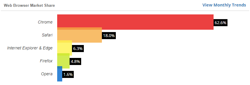
If you’re not sure which ones are worth your time, or you simply want to streamline your testing process, w3counter has gathered data about the most used browsers and puts out a report at the end of every single month. Here’s the September 2020 one.
 The only complication here is when you want to test your website on Safari but don’t have access to any Apple devices, as Apple has discontinued support for it’s Safari for Windows application - but we’ll cover that further down.
Cross Platform Testing

Testing your website on different platforms is somewhat more challenging than testing the browsers.
And just for clarity’s sake, I’m using “platform” as a catch-all term for both operating system and device.
The best way to do cross platform testing is to use the real-world devices we covered in the UAT section above. Maybe borrow a colleague’s Mac for an hour, or ask your android-wielding mate to take a look at it.
That aside, both the online and offline tools we’re about to cover can all test for different device types, all without you having to gain access to a real-world version of the device.
Online Testing Tools

There are quite a few different online browser testing tools available out there and, as a bonus, they can basically all test different devices as well! So your mobile device browser testing is covered as well.
They pretty much all have the same basic premise and it’s really down to your own specific needs and preferences as to which one you choose.
It’s worth noting though, that these are generally paid services with limited free capabilities. LambdaTest, for example, is one such online testing tool that offers six free sessions a month with a limit of 10 minutes on each session.
I’m not going to go into a full breakdown of each of your options, but I can offer suggestions on a few of the ones I’ve tried before:
Inspect Mode
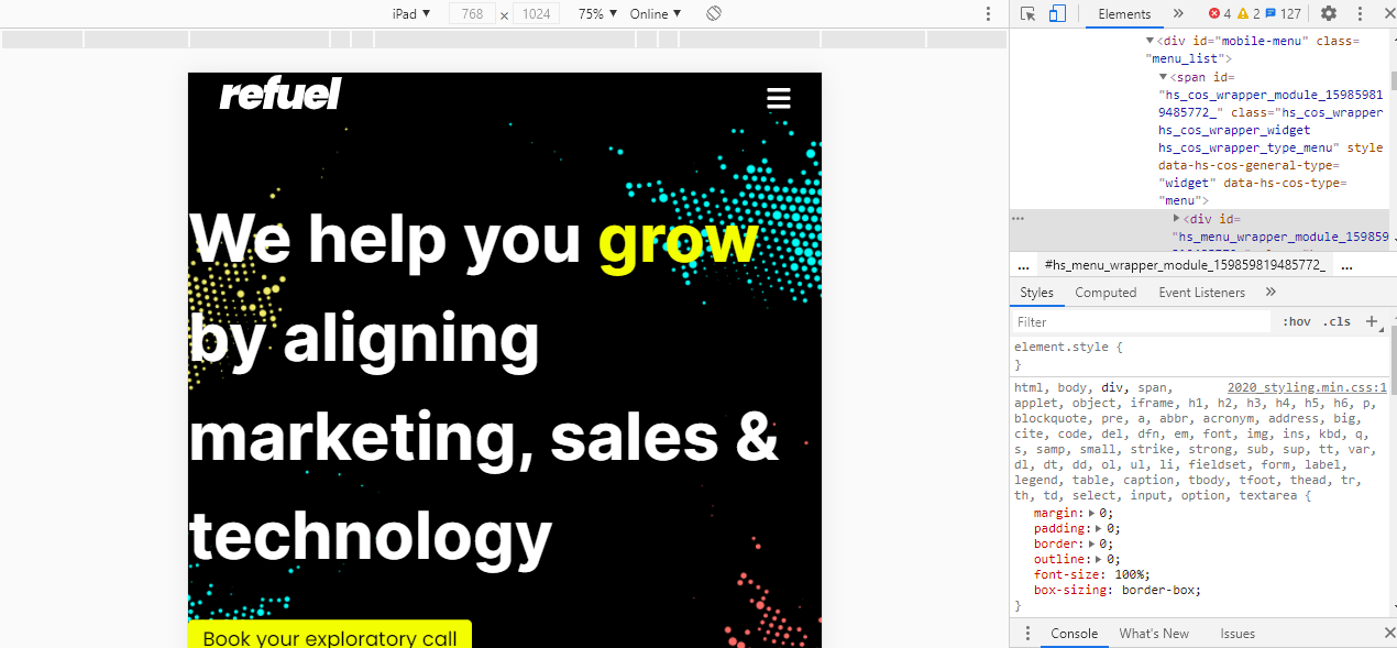
There is one other way to test different devices. It’s not perfect, but it’s easy to access and a good starting point. And that is the Inspect Tool that’s available in basically all major browsers.
If you right-click on a webpage, at or near the bottom of the dropdown menu, there should be an option called “inspect”, “inspect element” or something along those lines. Select that and you’ll be able to view the code behind the webpage.
At first glance that might not seem super-useful, but if you look around the inspection tools, you should see an option to enter “responsive design mode”, “toggle device toolbar” or something similar. They all call it different names but they all do the same thing: that is, to let you select different devices/resolutions to see how the webpage renders on them.
Offline Testing Tools
We’ve now covered online tools, but what about offline tools? They do exist, but are substantially more complicated to set up, primarily because the online ones don’t require any set up at all.
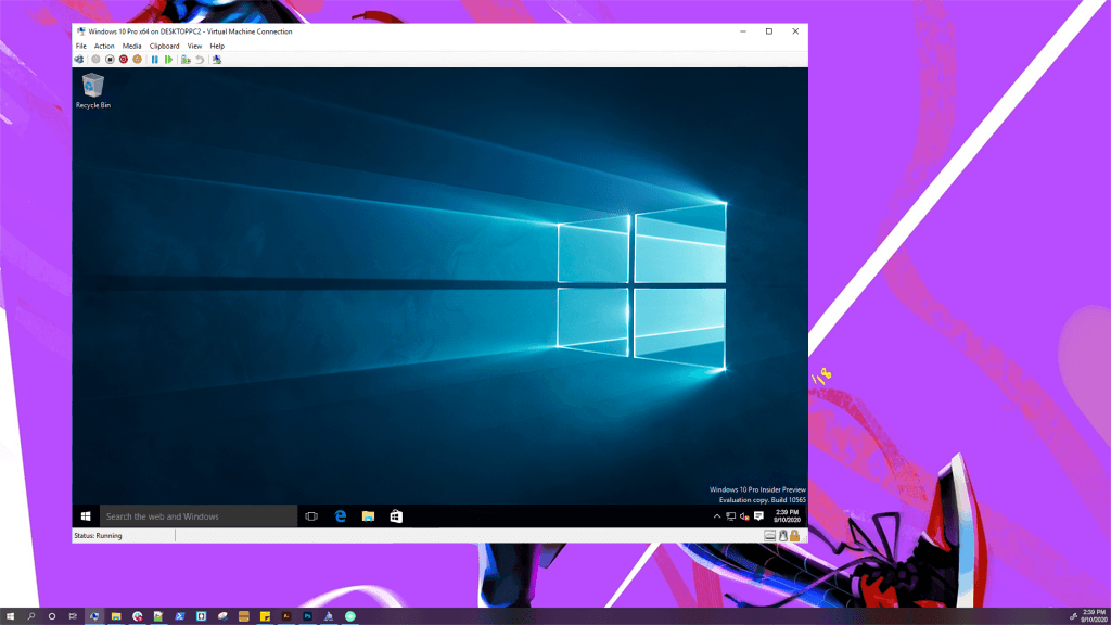
The main tool for offline testing (aside from a real life version of the machine) is what’s called a “Virtual Machine” or VM.
A VM is basically all the software of a second computer, without any of the hardware. It’s located on, and runs through, your current computer. For our purposes we would be using it as a test environment to ensure cross browser compatibility on a device other than your own, to ensure a good user experience no matter the device.
If you’re interested in them, virtual machines can be incredibly useful and just straight up cool pieces of software. For an in depth walkthrough of installing a Mac VM on a Windows 10 machine, check out this guide by makeuseof.com.
And That’s All Folks
We’ve looked at a few different methods of testing, from UAT with physical devices to methods of simulating physical devices. And we’ve outlined at a few free and paid tools you can use both on and offline. Now all that’s left is for you to do it! Test your website, test your competitors website, test the websites of industry leaders, and see how they all stack up against each other.